Thursday, November 5, 2009



Tuesday, May 5, 2009
Exhibition Posters


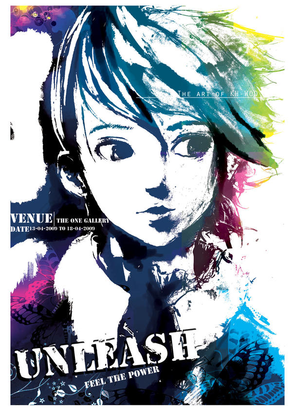


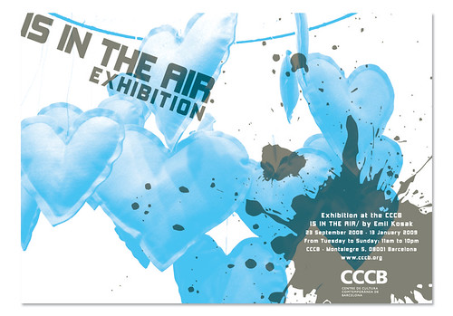


Tuesday, April 28, 2009
“Did You Know?”
This is a very well designed presentation of information. It conveys facts about our exponentially accelerating society that I think are good to keep in mind. These are issues that were brought up in Bruce Mau’s talk when he was at KU earlier this month—he quoted someone who noted that living in the 21st century was akin to living through 20,000 years of human development.
Thursday, April 16, 2009
Package Design for Fancy-ass Chocolate


Tuesday, April 7, 2009
Debbie Millman and Design Matters
Debbie Millman is the host of a weekly podcast, “Design Matters,” on which she interviews prominent graphic designers. I appreciated her introductions as well, which are—or have been on the few that I've listened to—self-contained anecdotes or essays that might not even be directly related to design (“I try to work science into [the show],” she commented after opening with a talk about evolution). I found the interviews to be interesting, but not especially insightful or revealing. Of course, I only listened to the first halves of them...
Nevile Brody had a few interesting things to say about the line between art and design—that artists are the ones who can commission themselves, whereas designers are commissioned. Not that shocking, but an interesting way to phrase it.
Chip Kidd mostly talked about the origins of his book, “The Learners,” which is about the Milgram experiments (if you haven't heard of them, look it up). Again, nothing too insightful as an interview, but of course Kidd was entertaining.
Monday, March 23, 2009
Interaction Design in Half Life 2: Episode 1

This article contained some interesting commentary on the design decisions that were involved in making Half Life 2: Episode 1 as well as an exploration of the way these decisions were disguised. This is coming from a story-telling or cinematic perspective that is typical of Valve's game design philosophy. Graphic design also often has story telling elements and this is dealing mostly with the development of the game and the conveying of ideas (show don't tell), so it's scope of usefulness includes the design discipline as well.
Half Life 2: Episode 1 Review on The Ant Nest
Tuesday, March 3, 2009
Thursday, January 22, 2009


Tuesday, January 20, 2009
Chip Kidd and John Gall


Chip Kidd and John Gall are graphic designers who specialize in book covers. Both work for imprints of Random House Publishing.
Kidd has made a name for himself by creating startling covers that break rules and take no prisoners. His covers are always conceptual and creative. He pulls influence from pop culture--early Batman merchandise packaging in particular--and often uses medical and technical illustrations and other retro appropriated imagery. The horizontal split is one of his trademarks. He is an important figure in the history of design because he stretched the boundries of cover design concepts. The images he uses for covers are not directly related to the title of the book and in fact seem to be completely tangential.
John Gall's style is similar to Kidd's. He uses a lot of collage like methods, arranging images haphazardly and using cutouts and overlaps.


Monday, January 19, 2009
VISC 314 Reading 01
- Message - The point or information the designer is trying to convey
- Transmission - The method of conveying the info. The medium.
- Noise - Interference due to cultural differences that might cause
the receiver to interpret the Message differently than
intended
- Addressee - The target audience.
- Receiver - Anyone who sees the product.
The book also mentions "Destination" and defines it as the result of the Message, but that is a terrible word choice.
- Signifier/Signified - It is important to remember that there are (almost)always
many different relationships between signifiers and
signified meanings. That is to say that an object or word
may signify a number of things depending on context,
culture, personal experience, etc.
Signifiers might be abstracted and they can draw
connections along lines that can be derived from cause
and effect relationships, anthropormorphic associations,
idioms and quotations, shared abstract concepts,
synecdoche (taking a part to mean to whole or vice versa),
or it may be arbitrary.
The text then moves on to the history and evolving purpose of logos. The desire to indicate origin and ownership is at the roots of their development and remains the primary goal, but in the mid 1900s they also became a way to present to the public a guarantee. It became something that would indicate to consumers that this product was of a certain quality, represented a set of commitments, or adhered to a certain mindset. They made the companies more personable, even if it really boiled down to a form of anthropormorphication. Today, with corporations becoming larger and having a larger staff in creative positions, the logo, mark(s), and/or style manual's role has become also a way of maintaining focus internally. The logo is now not only a point of recognition for the consumer, but a masthead for the employees.
Key terms:
- Message - The point or information the designer is trying to convey
- Mark/Signature - A symbol unique to a company used to indicate ownership
- Trademark - A mark that has been legally registered
- Wordmark - A signature that consists of the company's name in proprietary letterforms
- Symbol - The iconic portion of a logo. An image that is to be
synonymous with the company's name
- Monogram - A mark containing or consisting of a few letters (usu. an
acronym for the company name). It should be noted that
use of a monogram to replace a symbol/wordmark is unwise
due to the genericness of an acronym.
- Identity - The combination of the wordmark, symbol, colors, styles
and choice of imagery to create a defining aesthetic.
- Brand - The culmination of all of the audience's perceptions of
the company. Very closely related to Identity.
At the end of the reading, 16 starter questions were listed. They are a sort of springboard for client research...
01. What is your current position relative to other companies?*
02. What is your purpose/business? What do you offer/do?
03. What is your non-financial mission?
04. What is your business's internal structure?
05. Describe the internal culture of your company.
06. Describe your style.
07. What are your goals?
08. What are the greatest opportunities for the growth of the company's image?
(Note: This one is more of a rhetorical question the designer will have to determine)
09. What are your commitments?
10 & 11. What is your current/desired audience?
12 & 13. What is your audience's current/desired perception of you?
14. How do you compare with your competition?
15. What should your audience's response to their interaction with you be?
16. What is your marketing objective?
*This question is confusing. It needs to define the term "position."
Sunday, November 9, 2008
Who Was Otl Aicher?

German designer Otl Aicher was both prolific and world renowned from the 1950's until his death in 1991. His simple, bright design inspired many and the offshoots of his work can be seen even today. He is most famous for his work for the 1972 Olymic games, held in Munich.
Aicher was born as “Otto” in 1922—unfavorable times for Germany, which was being sanctioned in the wake of the first World War. His home was in a small community outside of Ulm and he was raised through early childhood in a stable environment, despite the national turmoil. When Otl was 11, the Nazi's rose into power. Otl, a reader of philosophy such as Plato and St. Thomas Aquinas, was of political views that were in direct opposition to the changes taking place in his country. These views did not make him many friends at school, but Otl found a few—most importantly the Scholl family—who shared both his distaste for the Nazi regime and his thirst for intellectual fulfillment. Unlike Aicher's parents, who were unsuportive of his intellectual endeavors, the Scholls were strong proponents of education through the arts and Otl spent a great deal of time with them. He began developing his artistic abilities by drawing floor plans, and, even at the young age of 15, his surviving sketches reveal a concern for design principles and a drive toward functionality.
During World War II, Aicher struggled to stay out of the German army, but was forced to serve from 1941-1945. Even during his military career, however, Otl found time to continue studying art and philosophy due to a combination of not being trusted with duties of any import and being frequently absent from combat due to injury or illness. After the close of the war, Otl returned to Ulm and rejoined with what remained of the Scholl family. Together they formed a group to help create a new community—called the Ulmer Kreis, or “The Ulm Circle of Friends”—and worked to establish a democratic society as they rebuilt their hometown in the literal sense as well. To the end of revitalizing the region intellectually, the Ulmer Kreis instituted a Thursday Lecture and is was in designing posters for this series that Aicher had his first experience in printing.
In 1946, Aicher briefly attended the Munich Academy of Art, but ultimately rejected high art in favor of practical design. This decision was part of a larger philosophical notion that rejected aestheticism. Thus Otl destroyed all of his art and set out on the path of design. He established Büro Aicher, his first design firm, and began doing work mainly for the Ulm museum and theater, as well as the newly established Ulmer Volkshochschule—a sort of community school. In 1953, he co-founded the Hochschule für Gestaltung Ulm—the “Ulm School of Design.” He taught there for years and it became renowned as one of the premiere German institutions for education. While there, he was on the leading edge of design development, developing theories of corporate “identity” and writing several books on the nature and methods of design, including “The Kitchen is for Cooking,” “Critique of the Automobile,” and “The World As Design.” He also worked with a team of his best students to create corporate logos for such companies as Braun and Lufthansa. Aicher was a visiting professor at Yale and Rio de Janeiro in 1958 and 1959 respectively.
The commission that is most remembered in the career of Otl Aicher—that embodies his entire philosophy and stands out as his defining achievement—was his work designing the imagery of the 1972 Munich Olympics. Otl's design theory for this project was to create imagery that—as always—served a practical purpose (Otl is quoted as saying, “Design must surrender to practical criteria”) but also, it was important to him, after the 1936 Berlin games, that the style of his design be cheerful, clear, bright, or, in German, “heiter.” This was to contrast the harsh tone of the previous games, which took place during the Nazi regime. Bright, saturated colors were used and the forms of people were abstracted into the most basic stick men. These figures—which followed a strict pattern of lines angled vertically, horizontally, or at a 45 degree angle—were used to create a wide array of pictograms representing each sport.
In order to understand the historical significance of Aicher's Olympic work, one must be aware of the increase in international communication and the need for universally accessible information. Pictograms were a way of making information international. Moreover, Aicher's color scheme of vibrant colors, which were not so nationalistic as to prioritize the color's of Germany's flag, worked to further make the design more accessible to outsiders.
In addition to color and symbols, Aicher focused on developing a format, or what could be thought of as a rubric that would carry through all of the posters, signs, flags, tickets, brochures, and other designed elements. This rubric consisted of a grid and a set of rules defining how elements were to interact. The design allowed for an amount of play, however, rather than just creating a sense of unity in the design.
Aicher then created, as Olympic host cities traditionally did, a unique icon to supplement the Olympic rings. This symbol contrasted those before it, which took iconography from the region such as a coat of arms, by being more abstract and universal. The design was a spiraling sunburst shape that was ambiguous enough to be interpreted as a number of things (a sun or star, a flower, or a laurel) but still universally conveyed energy, playfulness, and great spirit.
Finally, multiplying the fun-loving spirit of the design, was Aicher's creation of the mascot Waldi, a multi-colored, striped dachshund.
The whole effect of Aicher's design was vibrant, energetic, and progressive.
After the Olympic design job, Aicher began expanding on the pictograms created for it, coming up with an extremely wide array of symbols representing places, actions, regulations, facilities, transport options, directions, services, warnings, and more. Hundreds of these pictograms were created and used in airports, hospitals and the like. The male and female icons used on restroom signs are derived from Aicher's work in this vein.
During the Olympic project, Aicher began thinking about moving. Eventually, he found a suitable patch of land in the Allgäu region and designed and built a working community which he called the “autonomous republic of Rotis.” This estate was a self-sufficient establishment—with it's own water supply that also generated electricity—that was home to Aicher's family and their housekeeper. Aicher's studio staff lived in nearby villages. It was in this establishment that Aicher, late in his career, designed the Rotis typeface.
Rotis was meant to be somewhere in between roman and sans serif typefaces. It was designed in levels of serif, so to speak, with serif, semi-serif, semi-sans, and sans serif styles. The semi-serif style is achieved through a slight flair where strokes end. The semi-serif style basically consists of letters with serifs on their upper halves and without on the bottoms. The lower case 'c' and 'e' are the most distinctive letterforms of the family, having strokes that do not curl up at the bottom but rather point forward. The font family was met with mixed response, being adopted by many designers but criticized as being too quirky and poorly unified by some typeface designers.
The design movements that shaped Aicher's development started with modernism and the Russian Constructivist movement, and were ultimately driven by his pragmatic ideals. In his book, The World As Design, Aicher claims, “Design must rely on the same foundations as science and technology. It too draws life from argument. Art and metaphysics lie beyond argument.” In the 1940's, grids were coming into increasing use in the design field, thanks to Emil Ruder, and it was a method that Aicher latched onto and taught in his school. Another influence was Swiss designer Max Bill, who worked closely with Aicher during his days at the Hochschule für Gestaltung.
Otl Aicher died in 1991 after a trafic accident. He was 71 years old.