Information about the speech I chose to animate with type...
1. Who is speaking? - Former President Richard Milhous "Tricky Dick" Nixon
2. Why was the speech important? - This is Nixon's "not a crook speech" regarding his involvement in the Watergate scandal.
3. Why do you (I) find it interesting? - I was coming up with lots of visual ideas while listening to it, so you could say it struck me in that way.
4. What is the emotion, tone, feeling and personality of the speech? - Nixon is defending himself and his actions in a time in which things were starting to unravel for him. The following year, he would face trials for his impeachment that would ultimately succeed. Nevertheless, Nixon delivers the speech levelly and with some flair. It was a skill he had displayed on numerous occasions—whether or not he was being genuine—and it was a major factor in his election.
5. What is loud, soft, emphasized, etc.? - The speech is very level and calm, with some sections of subtle emphasis—"I am not a crook."
6. How does it make you/the audience feel? - There is—in light of the results of his trial and certain things it revealed about Nixon—irony in his words that kind of turns the speech on its head.
7. Short bio of speaker - "Richard Milhous Nixon was the 37th President of the United States (1969–1974) and the only president to resign the office. Nixon was elected to the presidency in 1968.
"The most immediate task facing President Nixon was the Vietnam War. He initially escalated the conflict, overseeing secret bombing campaigns, but soon withdrew American troops and successfully negotiated a ceasefire with North Vietnam, effectively ending American involvement in the war. His foreign policy was largely successful; he opened relations with the People's Republic of China and initiated détente with the Soviet Union. Domestically, he implemented new economic policies which called for wage and price control and the abolition of the gold standard. He was reelected by a landslide in 1972. In his second term, the nation was afflicted with economic difficulties. In the face of likely impeachment for his role in the Watergate scandal,[1] Nixon resigned on August 9, 1974."
-Quoted from Wikipedia
Thursday, March 26, 2009
Good Kinetic Type Examples
Lock, Stock and Two Smoking Barrels
Fargo
Goodfellas
There Will Be Blood
Requiem for a Dream
Star Wars
Fight Club (Rules)
^ This one is interesting because it makes use of motion tracking to put the words on a surface that is being shakily filmed.
Fight Club (Chemical Burn)
Fargo
Goodfellas
There Will Be Blood
Requiem for a Dream
Star Wars
Fight Club (Rules)
^ This one is interesting because it makes use of motion tracking to put the words on a surface that is being shakily filmed.
Fight Club (Chemical Burn)
Tuesday, March 24, 2009
SSSaFOHTW chapters
Typography II, Journal: March 10
Stop Stealing Sheep and Find Out How Type Works chapter summaries
1: Type is everywhere
Type is ubiquitous. It surrounds us, bombards us, whispers to us, encourages us, mocks us, startles us, or just prattles on and on, blithely unaware that we don't give a damn about what it has to say. Type is a method of conveying ideas, and it is one which is used extensively in our culture. Type design is important in facilitating clear, effective communication.
2: What is type
The methods of type creation and the styles and trends in type faces have changed drastically over time, but it is all fundamentally rooted in common ground.
3: Looking at type
In order to use type effectively, you must have an eye for it — you must train yourself to notice a font's shape and details.
4: Type with a purpose
Different type faces have different strengths and meanings, so choosing the right one becomes an important factor in design.
5: Type builds character
All typefaces have a tone that may or may not be appropriate for your project. Training yourself to become sensitive to the character of typefaces will help you make better decisions.
6: Types of type
There are some broad categories that typefaces fall into which can help identify them.
7: How it works
Spacing is also important. Be sure to utilize appropriate leading, tracking and kerning for a typeface. Also, it should be noted that different typefaces work best at different line lengths and sizes.
8: Putting it to work
Placement of type into logical, yet dynamic arrangements can hook the reader and keep him interested.
9: There is no bad type
Typefaces come into and fall out of favor. Fonts are almost never inherently good or bad. For every ugly font, there may very well be a situation in which it could be used quite effectively.
"Good"
Typography II, Journal: March 24
Good is a magazine, video series and a blog that is a source for extra articles. Their goal is to promote transparency and other conscientious philosophies (environmentalism, ethics, etc.). They have a clean, bright website (which I assume reflects the design found in the magazine as well)
I especially liked their so-called “transparencies,” which are basically visualizations of information, such as this one comparing the fuel efficiency of various modes of transport (taking into account the number of passengers).
Monday, March 23, 2009
Interaction Design in Half Life 2: Episode 1
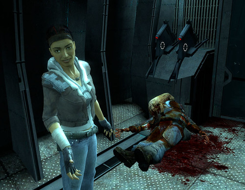
This article contained some interesting commentary on the design decisions that were involved in making Half Life 2: Episode 1 as well as an exploration of the way these decisions were disguised. This is coming from a story-telling or cinematic perspective that is typical of Valve's game design philosophy. Graphic design also often has story telling elements and this is dealing mostly with the development of the game and the conveying of ideas (show don't tell), so it's scope of usefulness includes the design discipline as well.
Half Life 2: Episode 1 Review on The Ant Nest
Tuesday, March 3, 2009
Subscribe to:
Posts (Atom)