Wednesday, April 29, 2009

Stain: a teacup

Link

This is a teacup that is "designed to improve through use" by making areas of the interior surface more susceptible to staining than the rest. The result is that it stains in a pattern:

Keri Smith's Ideas

Typography II, Journal: May 4

Keri Smith, a successful illustrator who works for such clients as Forbes, People, The New York Times, and Random House, has a bunch of fun—and sometimes quite useful—kits and ideas on her website. When I say useful, I'm talking about some of her ideas for self motivation or what could be thought of as creativity pick-me-ups. Often, when working in a creative field, one hits a wall—or simply runs out of steam—and the joy of creating disappears. Everything you do seems like a failure, and you can't seem to come up with any ideas. We've all been there.

Keri's list of "100 Ideas (a work in progress)" contains 95 activities to stimulate you creatively (the last 5 are blank so that you can fill them in with your own ideas). There is no explanation and there are no instructions aside from "pick randomly." My interpretation is that these are things you should do regularly (ie. one a day) in order to keep your mind fresh.

Tuesday, April 28, 2009

“Did You Know?”

Typography II, Journal: April 28


This is a very well designed presentation of information. It conveys facts about our exponentially accelerating society that I think are good to keep in mind. These are issues that were brought up in Bruce Mau’s talk when he was at KU earlier this month—he quoted someone who noted that living in the 21st century was akin to living through 20,000 years of human development.

Sunday, April 26, 2009

Thank You for Smoking title sequence


A good example of kinetic type that uses cigarette box designs from around the '40s and '50s.

Saturday, April 25, 2009

Pixar Animator Angus MacLane on How LEGO Helps/Relates to His Job

Full Brothers Brick interview.

TBB: How does your “day job” as an animator influence your LEGO hobby?

Angus: Mostly I build with LEGO as a way to unwind from a day spent in front of the computer. The tactile nature of LEGO can be much more satisfying than working in the often intangible realm of the computer. Also, a large part of an animator’s job is to clearly communicate an idea through the pose of a character. I think this is similar to building with LEGO where part of the goal is to sculpt clear shapes that communicate the purpose of the creation.
TBB: Has your LEGO hobby helped your “real” job in any way?

Angus: LEGO gets you used to thinking and designing in three dimensions. It has really helped my ability to visualize spatial relations. This is especially useful when working with artists and technical directors to take 2D designs and successfully turn them into 3D character models.

Also, when building with LEGO you often have to simplify or caricature the intended form. This is similar to caricaturing motion and simplifying acting ideas, which is an important part of the animation process.

Tuesday, April 21, 2009

Nixon's "Not a Crook" Speech


Final version of the Type Visualization of Nixon's "Crook" Speech. Higher quality version.

Fonts used: Chaparral Pro (Bold), Birch Std, 3 the Hard Way

Thursday, April 16, 2009

Type II Nixon Speech (almost done)

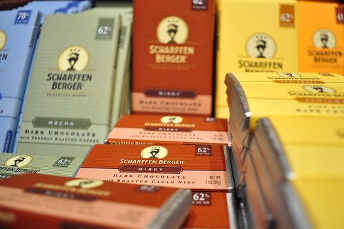
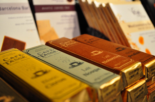
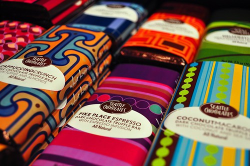
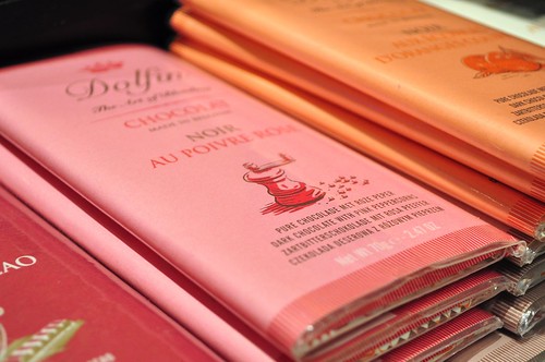
Package Design for Fancy-ass Chocolate

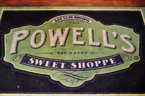
A friend of mine posted a bunch of pictures on Flickr from a fancy sweet “shoppe” in San Luis Obispo. Photos by Zak Vta.


Friday, April 10, 2009

Making an Em Dash in Windows

I was looking for a program that would let me insert em/en dashes etc. on Windows like I can on Macs (ie by hitting Alt+Shift+[Hypen]), when I found out that there is a similar shortcut built in. It's longer and much harder to remember, but it's much easier than searching through every glyph in Windows' Character Map. The shortcut is [Alt+0,1,5,1]. Hold Alt, then on the num-pad on the right of the keyboard, press 0151 in sequence, then release Alt and the dash will be inserted. Presumably there are other hidden glyphs that could be inserted with similar codes. I tried 0150 and, sure enough, it was an en dash.

If you can’t use the num-pad (if you're on a computer with a small keyboard, for example) you can use the Windows Character Map (usu. located under Applications in the Start Menu). When it opens, it will have a list of every glyph in Ariel (you can change the font, but for the em dash, there’s really no point). When you mouse over each glyph, its name should pop up so you can be sure you’re using the right dash, then double click it and hit the copy button—it’ll make sense when you’re looking at it.

Another idea is to make a simple html page with a bunch of different unusual characters using html code (I think the em dash is “& mdash;” without the space) so then you could just bring up that page and copy and paste from there.

Tuesday, April 7, 2009

Debbie Millman and Design Matters

Typography II, Journal: April 7

Debbie Millman is the host of a weekly podcast, “Design Matters,” on which she interviews prominent graphic designers. I appreciated her introductions as well, which are—or have been on the few that I've listened to—self-contained anecdotes or essays that might not even be directly related to design (“I try to work science into [the show],” she commented after opening with a talk about evolution). I found the interviews to be interesting, but not especially insightful or revealing. Of course, I only listened to the first halves of them...

Nevile Brody had a few interesting things to say about the line between art and design—that artists are the ones who can commission themselves, whereas designers are commissioned. Not that shocking, but an interesting way to phrase it.

Chip Kidd mostly talked about the origins of his book, “The Learners,” which is about the Milgram experiments (if you haven't heard of them, look it up). Again, nothing too insightful as an interview, but of course Kidd was entertaining.