This is a recut trailer for the upcoming movie "2012," showing the true plot of the movie. It has great 70s style motion graphics (probably done better than anything was done in the 70s) and awesome cheesy 70s music.
Friday, November 13, 2009
Sunday, November 8, 2009
Creations for Charity
I donated my efforts toward this logo for a project to sell people's personal LEGO creations and use the money to buy LEGO for underprivileged children.
This is the last version I produced, which was then taken to someone else who is going to draw the minifigure tilted back so that you can see it's face.

The font is 100% custom, made from scratch based on the shape of a minifigure's hand for the C.
[Edit]: *Urk* This is the final "design" they used...

This is the last version I produced, which was then taken to someone else who is going to draw the minifigure tilted back so that you can see it's face.
The font is 100% custom, made from scratch based on the shape of a minifigure's hand for the C.
[Edit]: *Urk* This is the final "design" they used...
Thursday, November 5, 2009

Tuesday, May 5, 2009
Designing a kinetic series: CAKE
I remembered a good example of a kinetic system—CAKE's album covers.


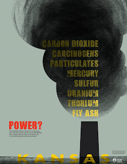
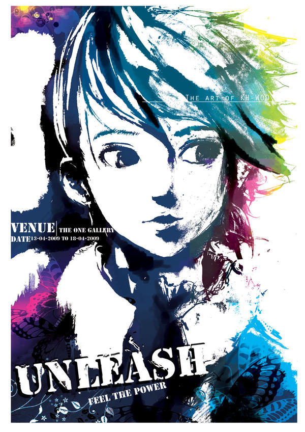
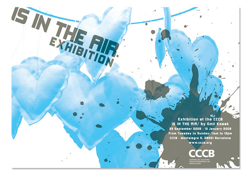
Exhibition Posters
Here's a bunch of good examples of exhibition posters. The first two are also a good example of a kinetic series (although they both use the same picture). If you can't see all of an image, just click on it.


Wednesday, April 29, 2009
Stain: a teacup
Link
This is a teacup that is "designed to improve through use" by making areas of the interior surface more susceptible to staining than the rest. The result is that it stains in a pattern:

This is a teacup that is "designed to improve through use" by making areas of the interior surface more susceptible to staining than the rest. The result is that it stains in a pattern:
Keri Smith's Ideas
Typography II, Journal: May 4
Keri Smith, a successful illustrator who works for such clients as Forbes, People, The New York Times, and Random House, has a bunch of fun—and sometimes quite useful—kits and ideas on her website. When I say useful, I'm talking about some of her ideas for self motivation or what could be thought of as creativity pick-me-ups. Often, when working in a creative field, one hits a wall—or simply runs out of steam—and the joy of creating disappears. Everything you do seems like a failure, and you can't seem to come up with any ideas. We've all been there.
Keri's list of "100 Ideas (a work in progress)" contains 95 activities to stimulate you creatively (the last 5 are blank so that you can fill them in with your own ideas). There is no explanation and there are no instructions aside from "pick randomly." My interpretation is that these are things you should do regularly (ie. one a day) in order to keep your mind fresh.
Tuesday, April 28, 2009
“Did You Know?”
Typography II, Journal: April 28
This is a very well designed presentation of information. It conveys facts about our exponentially accelerating society that I think are good to keep in mind. These are issues that were brought up in Bruce Mau’s talk when he was at KU earlier this month—he quoted someone who noted that living in the 21st century was akin to living through 20,000 years of human development.
This is a very well designed presentation of information. It conveys facts about our exponentially accelerating society that I think are good to keep in mind. These are issues that were brought up in Bruce Mau’s talk when he was at KU earlier this month—he quoted someone who noted that living in the 21st century was akin to living through 20,000 years of human development.
Sunday, April 26, 2009
Thank You for Smoking title sequence
A good example of kinetic type that uses cigarette box designs from around the '40s and '50s.
Saturday, April 25, 2009
Pixar Animator Angus MacLane on How LEGO Helps/Relates to His Job
Full Brothers Brick interview.
TBB: How does your “day job” as an animator influence your LEGO hobby?
 Angus: Mostly I build with LEGO as a way to unwind from a day spent in front of the computer. The tactile nature of LEGO can be much more satisfying than working in the often intangible realm of the computer. Also, a large part of an animator’s job is to clearly communicate an idea through the pose of a character. I think this is similar to building with LEGO where part of the goal is to sculpt clear shapes that communicate the purpose of the creation.
TBB: Has your LEGO hobby helped your “real” job in any way?
Angus: LEGO gets you used to thinking and designing in three dimensions. It has really helped my ability to visualize spatial relations. This is especially useful when working with artists and technical directors to take 2D designs and successfully turn them into 3D character models.
Also, when building with LEGO you often have to simplify or caricature the intended form. This is similar to caricaturing motion and simplifying acting ideas, which is an important part of the animation process.
TBB: How does your “day job” as an animator influence your LEGO hobby?
Angus: Mostly I build with LEGO as a way to unwind from a day spent in front of the computer. The tactile nature of LEGO can be much more satisfying than working in the often intangible realm of the computer. Also, a large part of an animator’s job is to clearly communicate an idea through the pose of a character. I think this is similar to building with LEGO where part of the goal is to sculpt clear shapes that communicate the purpose of the creation.TBB: Has your LEGO hobby helped your “real” job in any way?
Angus: LEGO gets you used to thinking and designing in three dimensions. It has really helped my ability to visualize spatial relations. This is especially useful when working with artists and technical directors to take 2D designs and successfully turn them into 3D character models.
Also, when building with LEGO you often have to simplify or caricature the intended form. This is similar to caricaturing motion and simplifying acting ideas, which is an important part of the animation process.
Tuesday, April 21, 2009
Nixon's "Not a Crook" Speech
Final version of the Type Visualization of Nixon's "Crook" Speech. Higher quality version.
Fonts used: Chaparral Pro (Bold), Birch Std, 3 the Hard Way
Thursday, April 16, 2009
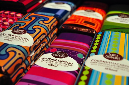
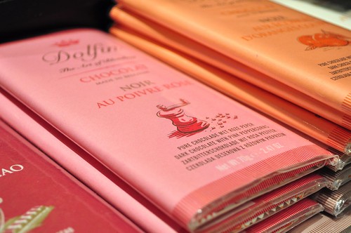
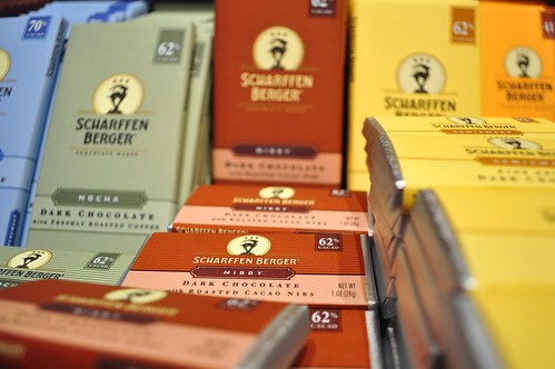
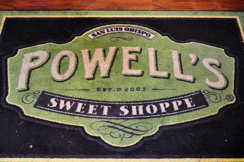
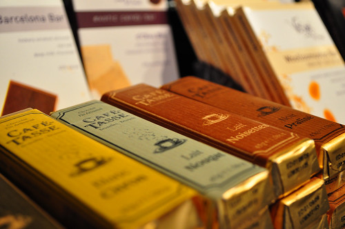
Package Design for Fancy-ass Chocolate
A friend of mine posted a bunch of pictures on Flickr from a fancy sweet “shoppe” in San Luis Obispo. Photos by Zak Vta.


Friday, April 10, 2009
Making an Em Dash in Windows
I was looking for a program that would let me insert em/en dashes etc. on Windows like I can on Macs (ie by hitting Alt+Shift+[Hypen]), when I found out that there is a similar shortcut built in. It's longer and much harder to remember, but it's much easier than searching through every glyph in Windows' Character Map. The shortcut is [Alt+0,1,5,1]. Hold Alt, then on the num-pad on the right of the keyboard, press 0151 in sequence, then release Alt and the dash will be inserted. Presumably there are other hidden glyphs that could be inserted with similar codes. I tried 0150 and, sure enough, it was an en dash.
If you can’t use the num-pad (if you're on a computer with a small keyboard, for example) you can use the Windows Character Map (usu. located under Applications in the Start Menu). When it opens, it will have a list of every glyph in Ariel (you can change the font, but for the em dash, there’s really no point). When you mouse over each glyph, its name should pop up so you can be sure you’re using the right dash, then double click it and hit the copy button—it’ll make sense when you’re looking at it.
Another idea is to make a simple html page with a bunch of different unusual characters using html code (I think the em dash is “& mdash;” without the space) so then you could just bring up that page and copy and paste from there.
Tuesday, April 7, 2009
Debbie Millman and Design Matters
Typography II, Journal: April 7
Debbie Millman is the host of a weekly podcast, “Design Matters,” on which she interviews prominent graphic designers. I appreciated her introductions as well, which are—or have been on the few that I've listened to—self-contained anecdotes or essays that might not even be directly related to design (“I try to work science into [the show],” she commented after opening with a talk about evolution). I found the interviews to be interesting, but not especially insightful or revealing. Of course, I only listened to the first halves of them...
Nevile Brody had a few interesting things to say about the line between art and design—that artists are the ones who can commission themselves, whereas designers are commissioned. Not that shocking, but an interesting way to phrase it.
Chip Kidd mostly talked about the origins of his book, “The Learners,” which is about the Milgram experiments (if you haven't heard of them, look it up). Again, nothing too insightful as an interview, but of course Kidd was entertaining.
Tuesday, March 31, 2009
John Maeda's Laws of Simplicity
Typography II, Journal: March 31
John Maeda is a renowned graphic designer who currently holds the chair of The Rhode Island School of Design President. He has been a strong proponent of simplicity in design and is the author of The Laws of Simplicity, a summation of his thoughts on how and why to strip away the unnecessary parts of one’s design. Maeda has divided up this process, which he refers to as “thoughtful reduction,” into ten “laws” (I think the term “law” isn't really appropriate—I would call them “methods,” “steps,” or even simply “topics,” but I didn't write the book).
Law1_reduce(); Strip away functionality. Question the number of things the product needs to do or how much information the design needs to communicate.
Law2_organize(); “Organization makes a system of many appear few.” A simple grouping of like items can allow large groups of items to be dealt with (physically or mentally) at a time. As one commenter on Maeda's blog said, this concept could be expanded to include abstraction—which is more of a mental organizational tool and perhaps is inherent to the organization process—is no less useful to understand.
#Andrew Stribblehill December 16, 2006
If by organisation, we are talking about aggregation of related objects, I think abstraction is a similar, but potentially more powerful, concept.
I don’t need to worry about how my clean socks are organised, for example, because I know they’re in my sock drawer. Now I only need concern myself with the (less flexible) interactions between me and the sock drawer rather than with individual socks. (It also makes them easier to count, which I see as a hint that it’s a useful abstraction.)
Somewhat related to abstraction are metaphor, allegory and approximation. When applied helpfully, each allows us to work at a higher level by being able to ignore underlying complexity.
#Maeda December 16, 2006
Thanks Andrew, yes, “abstraction” is a good way to frame the entire space of simplicity. It represents the fact that you know where your socks are, thus you do not have to open each drawer to find them. Abstractions work best when they are tacitly understood. Seems kind of odd that abstractions have to be concrete … sort of an oxymoron to mull over on a lazy Saturday :-)
Law3_time(); “Savings in time feel like simplicity.” This rule is so simple it hardly warrants explanation. Suffice it to recant the old comedian's mantra "Brevity is the essence of wit."
Law4_learn(); This one isn't immediately obvious, but is in fact rudimentary: knowledge is power—the power to simplify. The example that Maeda uses is perfect, so I won't tamper with it:
Law5_differences(); Simplicity stands out when compared with complexity. A simple design will shine through a haze of complex competitors. A more intriguing question, which is not addressed in Maeda's blog post, is “how could one incorporate both complexity and simplicity into a design so that the simplicity is properly appreciated.”
Another interesting question, which was raised by a commenter, was whether complexity could shine through a haze of simplicity. The poster posited that it could not. “Complexity can’t eat simple, but the simple can eat complexity.” Intuitively, I think he's right, but it's worth some thought.
Law6_context(); “What lies in the periphery of simplicity is definitely not peripheral.” For whatever reason, that is all there is to this rule. No explanation whatsoever on the site. The comments, however, offer some interesting interpretations and ideas.
Law7_emotion(); “More emotions are better than [fewer].” Apparently the site only has descriptions for the first 5 laws (presumably to promote the sale of the book). One way to interpret this is simply to say that emotion is an engaging experience, and so designing products that your audience can connect with emotionally will, of course, have more impact.
Law8_trust(); “In simplicity we trust.” This seemingly vague and reletively useless rule is actually a meaningful explanation of why simplicity is effective. As one commenter put it, “Trust wants transparency. Transparency wants simplicity.” In other words, if a design is simple—if it doesn't seem like it is hiding anything—it seems more trustworthy and the user/audience will, in theory, be more inclined to interact with it and invest time in it.
But, there is a flipside to this in that complexity can draw people in. It is fascinating and deep. The application is of course paramount in deciding where the design should rest on this continuum, but very rarely, I think should one make something entirely simple or impenetrably complex.
Law9_failure(); “Some things can never be made simple.”
Law10_theOne(); “Simplicity is about subtracting the obvious, and adding the meaningful.” Maeda says that he meant this rule to be a summation of the previous laws. I think it's an elegant way of putting it.
As a closing note, it should be said that these are not only design concerns. The laws of simplicity can—and probably should—be applied to other areas of life.
John Maeda is a renowned graphic designer who currently holds the chair of The Rhode Island School of Design President. He has been a strong proponent of simplicity in design and is the author of The Laws of Simplicity, a summation of his thoughts on how and why to strip away the unnecessary parts of one’s design. Maeda has divided up this process, which he refers to as “thoughtful reduction,” into ten “laws” (I think the term “law” isn't really appropriate—I would call them “methods,” “steps,” or even simply “topics,” but I didn't write the book).
Law1_reduce(); Strip away functionality. Question the number of things the product needs to do or how much information the design needs to communicate.
Law2_organize(); “Organization makes a system of many appear few.” A simple grouping of like items can allow large groups of items to be dealt with (physically or mentally) at a time. As one commenter on Maeda's blog said, this concept could be expanded to include abstraction—which is more of a mental organizational tool and perhaps is inherent to the organization process—is no less useful to understand.
#Andrew Stribblehill December 16, 2006
If by organisation, we are talking about aggregation of related objects, I think abstraction is a similar, but potentially more powerful, concept.
I don’t need to worry about how my clean socks are organised, for example, because I know they’re in my sock drawer. Now I only need concern myself with the (less flexible) interactions between me and the sock drawer rather than with individual socks. (It also makes them easier to count, which I see as a hint that it’s a useful abstraction.)
Somewhat related to abstraction are metaphor, allegory and approximation. When applied helpfully, each allows us to work at a higher level by being able to ignore underlying complexity.
#Maeda December 16, 2006
Thanks Andrew, yes, “abstraction” is a good way to frame the entire space of simplicity. It represents the fact that you know where your socks are, thus you do not have to open each drawer to find them. Abstractions work best when they are tacitly understood. Seems kind of odd that abstractions have to be concrete … sort of an oxymoron to mull over on a lazy Saturday :-)
Law3_time(); “Savings in time feel like simplicity.” This rule is so simple it hardly warrants explanation. Suffice it to recant the old comedian's mantra "Brevity is the essence of wit."
Law4_learn(); This one isn't immediately obvious, but is in fact rudimentary: knowledge is power—the power to simplify. The example that Maeda uses is perfect, so I won't tamper with it:
Operating a screw is deceptively simple. Just mate the grooves atop the screw’s head to the appropriate tip—slotted or Phillips—of a screwdriver. What happens next is not as simple, as you may have noted while observing a child or a woefully sheltered adult turning the screwdriver in the wrong direction.
My children remember this rule through a mnemonic taught by my spouse, “righty tighty, lefty loosy.” Personally I use the analogy of a clock, and map the clockwise motion of the hands to the positive penetration curve of the screw. Both methods are subject to a second layer of knowledge: knowing right versus left, or knowing what direction the hands of a clock turn. Thus operating a screw is not as simple as it appears. And it’s such an apparently simple object!
My children remember this rule through a mnemonic taught by my spouse, “righty tighty, lefty loosy.” Personally I use the analogy of a clock, and map the clockwise motion of the hands to the positive penetration curve of the screw. Both methods are subject to a second layer of knowledge: knowing right versus left, or knowing what direction the hands of a clock turn. Thus operating a screw is not as simple as it appears. And it’s such an apparently simple object!
Law5_differences(); Simplicity stands out when compared with complexity. A simple design will shine through a haze of complex competitors. A more intriguing question, which is not addressed in Maeda's blog post, is “how could one incorporate both complexity and simplicity into a design so that the simplicity is properly appreciated.”
Another interesting question, which was raised by a commenter, was whether complexity could shine through a haze of simplicity. The poster posited that it could not. “Complexity can’t eat simple, but the simple can eat complexity.” Intuitively, I think he's right, but it's worth some thought.
Law6_context(); “What lies in the periphery of simplicity is definitely not peripheral.” For whatever reason, that is all there is to this rule. No explanation whatsoever on the site. The comments, however, offer some interesting interpretations and ideas.
Law7_emotion(); “More emotions are better than [fewer].” Apparently the site only has descriptions for the first 5 laws (presumably to promote the sale of the book). One way to interpret this is simply to say that emotion is an engaging experience, and so designing products that your audience can connect with emotionally will, of course, have more impact.
Law8_trust(); “In simplicity we trust.” This seemingly vague and reletively useless rule is actually a meaningful explanation of why simplicity is effective. As one commenter put it, “Trust wants transparency. Transparency wants simplicity.” In other words, if a design is simple—if it doesn't seem like it is hiding anything—it seems more trustworthy and the user/audience will, in theory, be more inclined to interact with it and invest time in it.
But, there is a flipside to this in that complexity can draw people in. It is fascinating and deep. The application is of course paramount in deciding where the design should rest on this continuum, but very rarely, I think should one make something entirely simple or impenetrably complex.
Law9_failure(); “Some things can never be made simple.”
Law10_theOne(); “Simplicity is about subtracting the obvious, and adding the meaningful.” Maeda says that he meant this rule to be a summation of the previous laws. I think it's an elegant way of putting it.
As a closing note, it should be said that these are not only design concerns. The laws of simplicity can—and probably should—be applied to other areas of life.
Thursday, March 26, 2009
Speech Q's
Information about the speech I chose to animate with type...
1. Who is speaking? - Former President Richard Milhous "Tricky Dick" Nixon
2. Why was the speech important? - This is Nixon's "not a crook speech" regarding his involvement in the Watergate scandal.
3. Why do you (I) find it interesting? - I was coming up with lots of visual ideas while listening to it, so you could say it struck me in that way.
4. What is the emotion, tone, feeling and personality of the speech? - Nixon is defending himself and his actions in a time in which things were starting to unravel for him. The following year, he would face trials for his impeachment that would ultimately succeed. Nevertheless, Nixon delivers the speech levelly and with some flair. It was a skill he had displayed on numerous occasions—whether or not he was being genuine—and it was a major factor in his election.
5. What is loud, soft, emphasized, etc.? - The speech is very level and calm, with some sections of subtle emphasis—"I am not a crook."
6. How does it make you/the audience feel? - There is—in light of the results of his trial and certain things it revealed about Nixon—irony in his words that kind of turns the speech on its head.
7. Short bio of speaker - "Richard Milhous Nixon was the 37th President of the United States (1969–1974) and the only president to resign the office. Nixon was elected to the presidency in 1968.
"The most immediate task facing President Nixon was the Vietnam War. He initially escalated the conflict, overseeing secret bombing campaigns, but soon withdrew American troops and successfully negotiated a ceasefire with North Vietnam, effectively ending American involvement in the war. His foreign policy was largely successful; he opened relations with the People's Republic of China and initiated détente with the Soviet Union. Domestically, he implemented new economic policies which called for wage and price control and the abolition of the gold standard. He was reelected by a landslide in 1972. In his second term, the nation was afflicted with economic difficulties. In the face of likely impeachment for his role in the Watergate scandal,[1] Nixon resigned on August 9, 1974."
-Quoted from Wikipedia
Good Kinetic Type Examples
Lock, Stock and Two Smoking Barrels
Fargo
Goodfellas
There Will Be Blood
Requiem for a Dream
Star Wars
Fight Club (Rules)
^ This one is interesting because it makes use of motion tracking to put the words on a surface that is being shakily filmed.
Fight Club (Chemical Burn)
Fargo
Goodfellas
There Will Be Blood
Requiem for a Dream
Star Wars
Fight Club (Rules)
^ This one is interesting because it makes use of motion tracking to put the words on a surface that is being shakily filmed.
Fight Club (Chemical Burn)
Tuesday, March 24, 2009
SSSaFOHTW chapters
Typography II, Journal: March 10
Stop Stealing Sheep and Find Out How Type Works chapter summaries
1: Type is everywhere
Type is ubiquitous. It surrounds us, bombards us, whispers to us, encourages us, mocks us, startles us, or just prattles on and on, blithely unaware that we don't give a damn about what it has to say. Type is a method of conveying ideas, and it is one which is used extensively in our culture. Type design is important in facilitating clear, effective communication.
2: What is type
The methods of type creation and the styles and trends in type faces have changed drastically over time, but it is all fundamentally rooted in common ground.
3: Looking at type
In order to use type effectively, you must have an eye for it — you must train yourself to notice a font's shape and details.
4: Type with a purpose
Different type faces have different strengths and meanings, so choosing the right one becomes an important factor in design.
5: Type builds character
All typefaces have a tone that may or may not be appropriate for your project. Training yourself to become sensitive to the character of typefaces will help you make better decisions.
6: Types of type
There are some broad categories that typefaces fall into which can help identify them.
7: How it works
Spacing is also important. Be sure to utilize appropriate leading, tracking and kerning for a typeface. Also, it should be noted that different typefaces work best at different line lengths and sizes.
8: Putting it to work
Placement of type into logical, yet dynamic arrangements can hook the reader and keep him interested.
9: There is no bad type
Typefaces come into and fall out of favor. Fonts are almost never inherently good or bad. For every ugly font, there may very well be a situation in which it could be used quite effectively.
"Good"
Typography II, Journal: March 24
Good is a magazine, video series and a blog that is a source for extra articles. Their goal is to promote transparency and other conscientious philosophies (environmentalism, ethics, etc.). They have a clean, bright website (which I assume reflects the design found in the magazine as well)
I especially liked their so-called “transparencies,” which are basically visualizations of information, such as this one comparing the fuel efficiency of various modes of transport (taking into account the number of passengers).
Monday, March 23, 2009
Interaction Design in Half Life 2: Episode 1
This article contained some interesting commentary on the design decisions that were involved in making Half Life 2: Episode 1 as well as an exploration of the way these decisions were disguised. This is coming from a story-telling or cinematic perspective that is typical of Valve's game design philosophy. Graphic design also often has story telling elements and this is dealing mostly with the development of the game and the conveying of ideas (show don't tell), so it's scope of usefulness includes the design discipline as well.
Half Life 2: Episode 1 Review on The Ant Nest
Tuesday, March 3, 2009
Wednesday, February 11, 2009

Monday, February 9, 2009
Type Heresey
Commandments | Perversions
I
Thou shalt not apply more than three typeface in a document.
Break the fetters imposed by the use of only three typefaces.
II
Thou shalt lay headlines large at the top of the page.
Let thine eyes be seduced by the hierarchy of type.
III
Thou shalt employ no other type size than 8pt to 10pt for body copy.
Do not forsake smaller or bigger sizes.
IV
Remember that a typeface that is not legible is not truly a typeface.
Be seduced into trying new and expressive typefaces.
V
Honour thy kerning, so that white space becomes visually equalized between characters.
Treat kerning and tracking with total irreverence.
VI
Thou shalt lay stress discreetly upon elements within text.
Entice the reader to sample the delights of your text.
VII
Thou shat not use only capitals when setting vast body copy.
Do not forgo the liberal use of capitals within your text.
VIII
Thou shalt always align letters and word on a baseline.
The Lord designed letterforms to stand side by side, but there is no harm in their being lured away from one another.
IX
Thou shalt use flush-left, ragged-right type alignment.
Yield to the temptation to align text in unusual ways.
X
Thou shalt not make lines too short or too long.
Lure the reader down unfamiliar paths.
Tuesday, January 27, 2009
Manifesto for Growth
Typography II, Journal: Jan 27
From the Bruce Mau Manifesto for Growth...
(#3) Process is more important than outcome.
When the outcome drives the process we will only ever go to where we've already been. If process drives outcome we may not know where we’re going, but we will know we want to be there.
This is something I need to work on. I usually run with one of the first ideas I think of, which is usually good, but I've seen the advantages of process-oriented design. It's that first stage of early development of ideas I have trouble with.
Thursday, January 22, 2009


Tuesday, January 20, 2009
Definitions
Typography II, Journal: Jan 20, Part 2
Series: A number of books that are published as a group because of a common author or theme (or for no reason at all). Books in a series are usually designed to look similar in some way as well.
Sequence: ?
Sign: The broad heading under which icon, symbol and index fall. Basically, a sign is something that indicates or leads one's thoughts to another or many other things.
Icon: An image that represents something in a very literal, straight forward way. The bell in the Taco Bell logo represents a bell.
Index: Uses a sensory pattern or signal to, by frequent correlation, indicate something else--often a cause or effect of the signal. For example, dark clouds mean rain, the sound of a bird means there is a bird. Because of the prerequisite that one must be directly experiencing the sensual signals, by the definition of "Icon Index and Symbol: Types of Signs," linked via the class blog, use of index in a book cover is impossible. One could of course use an icon to represent an index, however.
Symbol: An image or word that links to something else arbitrarily. This is the only difference between a symbol and an icon.
Chip Kidd and John Gall
Typography II, Journal: Jan 20


Chip Kidd and John Gall are graphic designers who specialize in book covers. Both work for imprints of Random House Publishing.
Kidd has made a name for himself by creating startling covers that break rules and take no prisoners. His covers are always conceptual and creative. He pulls influence from pop culture--early Batman merchandise packaging in particular--and often uses medical and technical illustrations and other retro appropriated imagery. The horizontal split is one of his trademarks. He is an important figure in the history of design because he stretched the boundries of cover design concepts. The images he uses for covers are not directly related to the title of the book and in fact seem to be completely tangential.
John Gall's style is similar to Kidd's. He uses a lot of collage like methods, arranging images haphazardly and using cutouts and overlaps.
Subscribe to:
Posts (Atom)