Showing posts with label typography. Show all posts

Thursday, November 5, 2009

Activist Posters

Text & Image:


Text:


The text version was selected for display in the Spencer Museum of Art.

Tuesday, May 5, 2009

Exhibition Posters

Here's a bunch of good examples of exhibition posters. The first two are also a good example of a kinetic series (although they both use the same picture). If you can't see all of an image, just click on it.


Sunday, April 26, 2009

Thank You for Smoking title sequence


A good example of kinetic type that uses cigarette box designs from around the '40s and '50s.

Tuesday, April 21, 2009

Nixon's "Not a Crook" Speech


Final version of the Type Visualization of Nixon's "Crook" Speech. Higher quality version.

Fonts used: Chaparral Pro (Bold), Birch Std, 3 the Hard Way

Thursday, April 16, 2009

Package Design for Fancy-ass Chocolate

A friend of mine posted a bunch of pictures on Flickr from a fancy sweet “shoppe” in San Luis Obispo. Photos by Zak Vta.


Thursday, March 26, 2009

Good Kinetic Type Examples

Lock, Stock and Two Smoking Barrels
Fargo
Goodfellas
There Will Be Blood
Requiem for a Dream
Star Wars
Fight Club (Rules)
^ This one is interesting because it makes use of motion tracking to put the words on a surface that is being shakily filmed.
Fight Club (Chemical Burn)

Tuesday, March 24, 2009

SSSaFOHTW chapters

Typography II, Journal: March 10

Stop Stealing Sheep and Find Out How Type Works chapter summaries

1: Type is everywhere
Type is ubiquitous. It surrounds us, bombards us, whispers to us, encourages us, mocks us, startles us, or just prattles on and on, blithely unaware that we don't give a damn about what it has to say. Type is a method of conveying ideas, and it is one which is used extensively in our culture. Type design is important in facilitating clear, effective communication.

2: What is type
The methods of type creation and the styles and trends in type faces have changed drastically over time, but it is all fundamentally rooted in common ground.

3: Looking at type
In order to use type effectively, you must have an eye for it — you must train yourself to notice a font's shape and details.

4: Type with a purpose
Different type faces have different strengths and meanings, so choosing the right one becomes an important factor in design.

5: Type builds character
All typefaces have a tone that may or may not be appropriate for your project. Training yourself to become sensitive to the character of typefaces will help you make better decisions.

6: Types of type
There are some broad categories that typefaces fall into which can help identify them.

7: How it works
Spacing is also important. Be sure to utilize appropriate leading, tracking and kerning for a typeface. Also, it should be noted that different typefaces work best at different line lengths and sizes.

8: Putting it to work
Placement of type into logical, yet dynamic arrangements can hook the reader and keep him interested.

9: There is no bad type
Typefaces come into and fall out of favor. Fonts are almost never inherently good or bad. For every ugly font, there may very well be a situation in which it could be used quite effectively.

Monday, February 9, 2009

Type Heresey

Commandments | Perversions
I
Thou shalt not apply more than three typeface in a document.
Break the fetters imposed by the use of only three typefaces.

II
Thou shalt lay headlines large at the top of the page.
Let thine eyes be seduced by the hierarchy of type.

III
Thou shalt employ no other type size than 8pt to 10pt for body copy.
Do not forsake smaller or bigger sizes.

IV
Remember that a typeface that is not legible is not truly a typeface.
Be seduced into trying new and expressive typefaces.

V
Honour thy kerning, so that white space becomes visually equalized between characters.
Treat kerning and tracking with total irreverence.

VI
Thou shalt lay stress discreetly upon elements within text.
Entice the reader to sample the delights of your text.

VII
Thou shat not use only capitals when setting vast body copy.
Do not forgo the liberal use of capitals within your text.

VIII
Thou shalt always align letters and word on a baseline.
The Lord designed letterforms to stand side by side, but there is no harm in their being lured away from one another.

IX
Thou shalt use flush-left, ragged-right type alignment.
Yield to the temptation to align text in unusual ways.

X
Thou shalt not make lines too short or too long.
Lure the reader down unfamiliar paths.

Thursday, January 22, 2009

Tuesday, January 20, 2009

Chip Kidd and John Gall

Typography II, Journal: Jan 20


Chip Kidd and John Gall are graphic designers who specialize in book covers. Both work for imprints of Random House Publishing.

Kidd has made a name for himself by creating startling covers that break rules and take no prisoners. His covers are always conceptual and creative. He pulls influence from pop culture--early Batman merchandise packaging in particular--and often uses medical and technical illustrations and other retro appropriated imagery. The horizontal split is one of his trademarks. He is an important figure in the history of design because he stretched the boundries of cover design concepts. The images he uses for covers are not directly related to the title of the book and in fact seem to be completely tangential.


John Gall's style is similar to Kidd's. He uses a lot of collage like methods, arranging images haphazardly and using cutouts and overlaps.


Sunday, November 23, 2008

Typography Rules and Terms

-- Parts of the grid: what are the following:
- margin: The whitespace around the edges of a spread
- column: A vertical strip in a grid
- alley: A narrow space between columns used to keep adjacent objects separated
- module: A unit of rectangular space in a grid
- gutter: A space in down the middle of a spread where space is left for the spine/fold of the book or magazine.
- folio: A leaf, which consists of two pages (front or "recto," and the back or "verso")

-- What are the advantages of a multiple column grid.?
Gives needed flexibility for documents with a complex hierarchy.

-- Why is there only one space after a period? Because fonts have spaces that are not the same width as a character, so discerning a space between sentences is not an issue as it was when typewriters were used (typewriters are monospaced)

-- What is a character (in typography)? One letter, number or other symbol.

-- How many characters is optimal for a line length? words per line? ~70, ~15

-- Why is the baseline grid used in design? To create a sense of coherency and order. People like to see things line up.

-- What is a typographic river? A ribbon of white space in the middle of a paragraph that is improperly justified.

-- What is a clothesline or flow line or hangline? An imaginary guideline that multiple objects hang from and that extends across a spread and often throughout an entire magazine.

-- How can you incorporate white space into your designs?
Like this


-- What is type color/texture? Text can be used as an aesthetic enhancement so that it appears to give the page texture when one views the entire page. It is important to think of your text boxes as fields of textural color as well as text.

-- What is x-height, how does it effect type color? The height of lowercase letters disregarding any ascenders.

-- Define Tracking. Extra space between (many) characters.

-- Define Kerning. Why do characters need to be kerned? What are the most common characters that need to be kerned (kerning pairs)? Usu. small adjustments in the spacing between two characters to make them appear equally spaced. Some character combinations appear unevenly spaced when next to each other, most commonly the capitals 'T,' 'Y,' 'V,' and 'W' (which have negative space underneath their extremities) and lowercase letters or capitals that slant the other way (such as 'A'). Some common "kerning pairs" have recommended kerning settings embedded into fonts and are applied automatically. Examples include AV, WA, Ro, etc. Periods after letters with overhanging right-side parts also present a kerning problem.

-- In justification or H&J terms what do the numbers: minimum, optimum, maximum mean? They are referring to word spacing and represent the range of options the spacing algorithm has (min/max) and the ideal word spacing that it should try to achieve as much as possible (optimum). Values are taken in a percentage of the regular space width.

-- What is the optimum space between words?

-- What are some ways to indicate a new paragraph. Are there any rules? First-line or hanging indent, space between paragraphs.

-- What are the rules associated with hyphenation? Avoid more than two consecutive lines being hyphenated, only hyphenate at a syllable break, avoid hyphenation in non-body text such as callouts.

-- What is a ligature? A character that combines multiple letterforms, such as an ampersand (E and T)

-- What does CMYK and RGB mean? Color spaces utilizing combinations of Cyan, Magenta, Yellow, and Black and Red, Green and Blue respectively. CMYK is an substractive color space and is used in print, RGB is additive and used in monitor and television displays. Using a CMYK space in a computer document will appear on screen as an approximation of what the picture or document will look like printed, though it is technically still displayed with red, green and blue light.

-- What does hanging punctuation mean? Moving the punctuation outside the bounding box so that the overall alignment appears more straight.

-- What is the difference between a foot mark and an apostrophe? What is the difference between an inch mark and a quote mark (smart quote)?
Apostrophes and quotes curve or slant toward the characters they surround, while foot/inch marks are vertical.

-- What is a hyphen, en dash and em dashes, what are the differences and when are they used? An em dash is a dash that is the full width of the character bounding box of the M in a font (or the point size, to put it another way), an en dash is half as wide (approximately the widh of an N), and a hyphen is 1/3 the width of an em dash.
En dashes are used to separate a parenthetical thought in mid text and always is surrounded by spaces. Some style guides recommend use of an em dash, either spaced or not, for this purpose. En dashes are also used in place of a hyphen when running together multiple-word or already hyphenated compound adjectives (such as in non-San Franciscan). Furthermore, the en dash is used to mean "through" in the context of denoting lengths of time and the like. (9:00--10:00)
Hyphens are used to hyphenate words.
Em dashes are often used to separate text, as mentioned earlier.


-- What is a widow and an orphan? A single word left on the last line of a paragraph / One or two words on a new page that are continued from a paragraph earlier in the document.

Wednesday, November 12, 2008

Helvetica: The Film

The film was surprisingly interesting. Not to say that is was very interesting, but it was more interesting than expected. I liked hearing arguments for and against it, and seeing the different ways it has been used. I think the most intriguing statement made was that Helvetica became a "club" or a "badge" that companies could show off--that put them in a certain class. I thought of a passage from Otl Aicher's book, The World As Design that described how people set themselves on pedestals by wearing clothes that are ill suited for their environment. The man who can afford to dress inappropriately is set apart from the rest (such as the football coach in pressed suit pants and dress shoes on the field). I don't think Helvetica is like a handicap, but some do.

I remain in the middle ground concerning the font. I don't think it's the god of fonts, but it is a versatile, neutral font, which is handy....

Sunday, November 9, 2008

Who Was Otl Aicher?


German designer Otl Aicher was both prolific and world renowned from the 1950's until his death in 1991. His simple, bright design inspired many and the offshoots of his work can be seen even today. He is most famous for his work for the 1972 Olymic games, held in Munich.

Aicher was born as “Otto” in 1922—unfavorable times for Germany, which was being sanctioned in the wake of the first World War. His home was in a small community outside of Ulm and he was raised through early childhood in a stable environment, despite the national turmoil. When Otl was 11, the Nazi's rose into power. Otl, a reader of philosophy such as Plato and St. Thomas Aquinas, was of political views that were in direct opposition to the changes taking place in his country. These views did not make him many friends at school, but Otl found a few—most importantly the Scholl family—who shared both his distaste for the Nazi regime and his thirst for intellectual fulfillment. Unlike Aicher's parents, who were unsuportive of his intellectual endeavors, the Scholls were strong proponents of education through the arts and Otl spent a great deal of time with them. He began developing his artistic abilities by drawing floor plans, and, even at the young age of 15, his surviving sketches reveal a concern for design principles and a drive toward functionality.

During World War II, Aicher struggled to stay out of the German army, but was forced to serve from 1941-1945. Even during his military career, however, Otl found time to continue studying art and philosophy due to a combination of not being trusted with duties of any import and being frequently absent from combat due to injury or illness. After the close of the war, Otl returned to Ulm and rejoined with what remained of the Scholl family. Together they formed a group to help create a new community—called the Ulmer Kreis, or “The Ulm Circle of Friends”—and worked to establish a democratic society as they rebuilt their hometown in the literal sense as well. To the end of revitalizing the region intellectually, the Ulmer Kreis instituted a Thursday Lecture and is was in designing posters for this series that Aicher had his first experience in printing.

In 1946, Aicher briefly attended the Munich Academy of Art, but ultimately rejected high art in favor of practical design. This decision was part of a larger philosophical notion that rejected aestheticism. Thus Otl destroyed all of his art and set out on the path of design. He established Büro Aicher, his first design firm, and began doing work mainly for the Ulm museum and theater, as well as the newly established Ulmer Volkshochschule—a sort of community school. In 1953, he co-founded the Hochschule für Gestaltung Ulm—the “Ulm School of Design.” He taught there for years and it became renowned as one of the premiere German institutions for education. While there, he was on the leading edge of design development, developing theories of corporate “identity” and writing several books on the nature and methods of design, including “The Kitchen is for Cooking,” “Critique of the Automobile,” and “The World As Design.” He also worked with a team of his best students to create corporate logos for such companies as Braun and Lufthansa. Aicher was a visiting professor at Yale and Rio de Janeiro in 1958 and 1959 respectively.

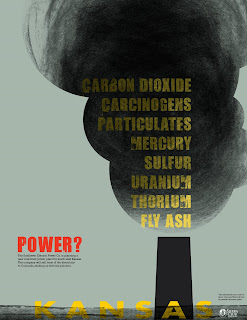
The commission that is most remembered in the career of Otl Aicher—that embodies his entire philosophy and stands out as his defining achievement—was his work designing the imagery of the 1972 Munich Olympics. Otl's design theory for this project was to create imagery that—as always—served a practical purpose (Otl is quoted as saying, “Design must surrender to practical criteria”) but also, it was important to him, after the 1936 Berlin games, that the style of his design be cheerful, clear, bright, or, in German, “heiter.” This was to contrast the harsh tone of the previous games, which took place during the Nazi regime. Bright, saturated colors were used and the forms of people were abstracted into the most basic stick men. These figures—which followed a strict pattern of lines angled vertically, horizontally, or at a 45 degree angle—were used to create a wide array of pictograms representing each sport.

In order to understand the historical significance of Aicher's Olympic work, one must be aware of the increase in international communication and the need for universally accessible information. Pictograms were a way of making information international. Moreover, Aicher's color scheme of vibrant colors, which were not so nationalistic as to prioritize the color's of Germany's flag, worked to further make the design more accessible to outsiders.

In addition to color and symbols, Aicher focused on developing a format, or what could be thought of as a rubric that would carry through all of the posters, signs, flags, tickets, brochures, and other designed elements. This rubric consisted of a grid and a set of rules defining how elements were to interact. The design allowed for an amount of play, however, rather than just creating a sense of unity in the design.

Aicher then created, as Olympic host cities traditionally did, a unique icon to supplement the Olympic rings. This symbol contrasted those before it, which took iconography from the region such as a coat of arms, by being more abstract and universal. The design was a spiraling sunburst shape that was ambiguous enough to be interpreted as a number of things (a sun or star, a flower, or a laurel) but still universally conveyed energy, playfulness, and great spirit.

Finally, multiplying the fun-loving spirit of the design, was Aicher's creation of the mascot Waldi, a multi-colored, striped dachshund.

The whole effect of Aicher's design was vibrant, energetic, and progressive.

After the Olympic design job, Aicher began expanding on the pictograms created for it, coming up with an extremely wide array of symbols representing places, actions, regulations, facilities, transport options, directions, services, warnings, and more. Hundreds of these pictograms were created and used in airports, hospitals and the like. The male and female icons used on restroom signs are derived from Aicher's work in this vein.

During the Olympic project, Aicher began thinking about moving. Eventually, he found a suitable patch of land in the Allgäu region and designed and built a working community which he called the “autonomous republic of Rotis.” This estate was a self-sufficient establishment—with it's own water supply that also generated electricity—that was home to Aicher's family and their housekeeper. Aicher's studio staff lived in nearby villages. It was in this establishment that Aicher, late in his career, designed the Rotis typeface.

Rotis was meant to be somewhere in between roman and sans serif typefaces. It was designed in levels of serif, so to speak, with serif, semi-serif, semi-sans, and sans serif styles. The semi-serif style is achieved through a slight flair where strokes end. The semi-serif style basically consists of letters with serifs on their upper halves and without on the bottoms. The lower case 'c' and 'e' are the most distinctive letterforms of the family, having strokes that do not curl up at the bottom but rather point forward. The font family was met with mixed response, being adopted by many designers but criticized as being too quirky and poorly unified by some typeface designers.

The design movements that shaped Aicher's development started with modernism and the Russian Constructivist movement, and were ultimately driven by his pragmatic ideals. In his book, The World As Design, Aicher claims, “Design must rely on the same foundations as science and technology. It too draws life from argument. Art and metaphysics lie beyond argument.” In the 1940's, grids were coming into increasing use in the design field, thanks to Emil Ruder, and it was a method that Aicher latched onto and taught in his school. Another influence was Swiss designer Max Bill, who worked closely with Aicher during his days at the Hochschule für Gestaltung.

Otl Aicher died in 1991 after a trafic accident. He was 71 years old.

Sunday, September 28, 2008

The History of Type, pg12

This section of the reading is basically just an introduction, so very little information is actually given...

Type is defined as the way ideas are given a concrete, visual form to facilitate communication. It's origins are derived from ancient times and many written languages used today have evolved from markings that were symbolic of specific objects rather than arbitrary characters.

Another point made is that the history of type is hazy due to advancements being made in different areas of the world during roughly the same time period. For example, though Guttenberg is generally credited with the invention of movable type in the 1440s, similar creations were produced by Italian, Netherlandic, and Chinese inventors, the earliest of which is credited to the Chinese Bi Sheng in the 1040s.

Also mentioned is the phenomenon of type of a certain style being directly associated with specific historic events, such as the script used to pen the Declaration of Independence.

Question - Is the history of typographical technology concrete? Copy and paste Cite at least one example to support your answer!

Wednesday, September 17, 2008

Typographic Terms

Absolute Measurements - Measuring scales which never change such as points, picas, inches, etc.

Relative Measurements - Measurements which vary depending on factors such as the font used. For example an 'em' or 'en' dash or space.

Kearning - Space between two characters. A--usually small--adjustment to the tracking. Often capitals with a lot of space on the under-righthand side will make adjacent lower-case characters appear too far away. This is an example of a time when a kearning adjustment is necessary.

Leading - The space between lines of text. Pronounced with a short 'e' sound.

Points/Picas - Units of measurement used in the printmaking business because they are easily divisible (12pt in a Pica; 12 is a multiple of 3 and 2). There are 6 picas in an inch.

x-height - The height of the 'x' character of a font (and most lowercase letters minus their ascenders and descenders). A relative measurement.

The em - A relative measurement equal to the point-size of the font. Used for spacing, indentation, etc.

The en - Half an em

Dashes (hyphen, en, em) - Horizontal lines of various lengths. The hyphen is 1/3 of an em in length.

Alignments: Justifcation, Flush Left, Flush Right - How a body of text meets it's boundries. Justified text is spaced so that the words on both sides of the paragraph touch the edges of it's container. A body of text that is either left or right aligned will only have words touching the boundries on one side, leaving the other side ragged.

Letterspacing - The spacing between letters...

Tracking - The spacing between lines of text measured from baseline to baseline.

Word Spacing - Spacing between words. Could be thought of as the width of a space.

Widow - A solitary word on the last line of a paragraph.

Orphan(s) - One or two words that were continued from a previous spread.

Indent, Fist Line Indent, Hanging Indent - A space that moves type away from the left edge (or right edge, if right aligned). First line indentation only occurs on the first line of a paragraph; a Hanging indent occurs on all lines except the first.

Tuesday, September 9, 2008

Who Was Adrian Frutiger

Adrian Frutiger is a Swiss typeface designer who is most famous for his Univers font, a grotesque (or, some claim, neo-grotesque) sans-serif font, meaning that it has lowercase letters as well as the capitals. Adrian was born in 1928 and started developing scripts in rebellion of the cursive taught in school. Later in life, he was an apprentice under Otto Schaerffli, then moved on to study calligraphy at the school of applied arts in Zürich. After this, he joined the Deberny & Peignot foundry, where he developed such fonts as "Président", "Phoebus", and "Ondine."

One of his innovations in typography was his invention of a two-integer numbering system to denote weight and width respectively (weight being the width of the line elements of the characters and width being the width of the entire character). Using 55 as a middle-ground (roman), fonts branch out (as shown in the grid pictured) ranging from the thin and condensed 39 (high numbers are condensed and low, extended, in the second place) to an extended bold 93, a condensed bold 67, and so on.

TYPO
Wikipedia - Adrian Frutiger
Wikipedia - Univers